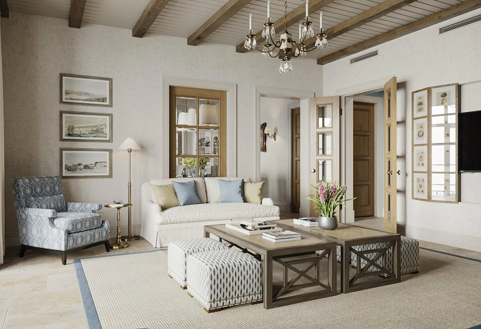
Organizing a comfortable space for a large family is not an easy task, because the rhythm of life, tastes and interests of representatives of different generations are also different.
We took this path: we combined modern style and classics in the design concept, softening both of these styles as much as possible. Classics may seem too strict, minimalist modern style can sometimes be too aggressive – I wanted to avoid this.
We focused on softness, comfort, attention to the natural – textures, colors, shapes. Plaster and wood were used for decoration. Matte textures were actively used. There is practically no gloss in this interior – only mirrors, which are used in certain areas to expand the space.
Technique 2: competently plan the main areas
Our task was to make the living space comfortable, and this required proper zoning. We worked with the purpose of the floors – there are four of them in the house, including the basement. The first two floors became a public area, where the hallway, living room, and owner’s office are located. The third and fourth are private spaces for family and close friends.


Leave a Reply